

Creating Custom Charts
Custom charts let you visualize anything you want. The easiest way to create one is with AI Query. Just describe the chart you want in plain English.The Easy Way: AI Query (Recommended)
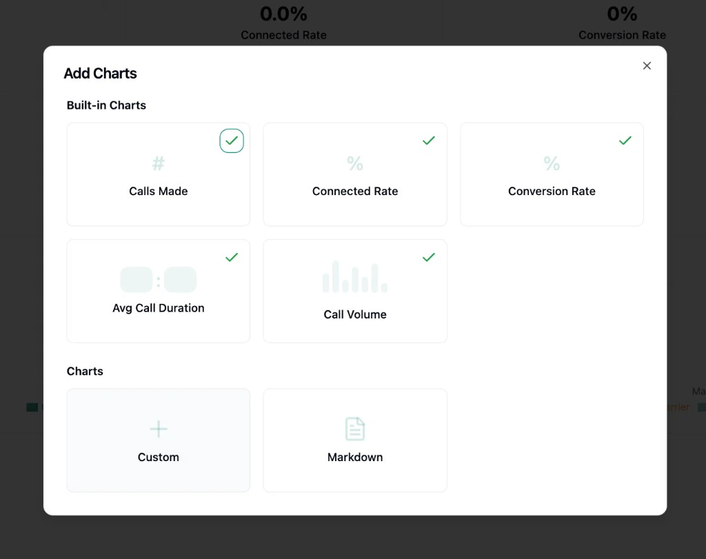
- Click Add Chart > Custom to open the chart builder.
- Click the AI Query button in the bottom-right corner of the editor.
- A chat sidebar opens. Describe the chart you want in plain English. For example:
- “Show me how many calls each agent made this month as a bar chart”
- “What’s my daily connected rate as a line chart?”
- “Create a table showing agent name, total calls, and conversion rate”
- “Build a combo chart with call volume as bars and connected rate as a line”
- The AI generates everything: the query, chart type, axes, title, and description.
- Review the result in the live preview. If you want changes, keep chatting:
- “Make it weekly instead of daily”
- “Add a conversion rate line”
- “Change this to a table”
- When you’re happy, click Save Chart.
The Manual Way: Writing SQL
If you want full control, you can also write SQL queries directly in the editor. Your queries run against two tables:strada_calls_history: contains all your call datastrada_chats_history: contains all your chat data
Understanding the Chart Builder
The chart builder has two main areas: the SQL editor at the top, and a split panel at the bottom.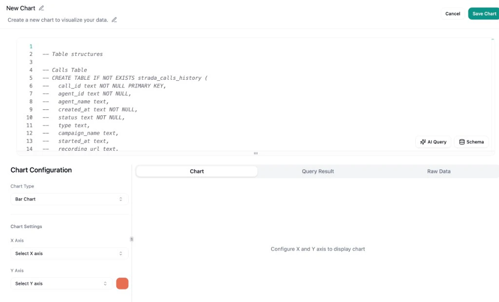
Preview Panel
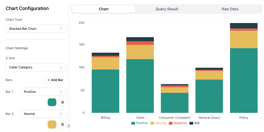
The right side shows a preview with three tabs:- Chart: a live visual preview of your chart. This is what will appear on your dashboard.
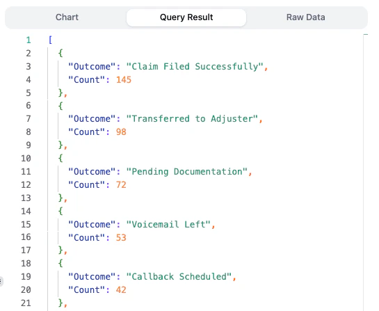
- Query Result: the data your SQL query returned, shown as JSON. Useful for verifying your query is producing the right numbers.
- Raw Data: all the underlying call and chat data loaded in your browser, shown as JSON. Useful for exploring what fields and values are available before you write a query.
Configuration Panel
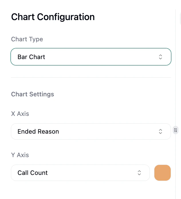
The left side is the Chart Configuration panel:- Pick a Chart Type from the dropdown (see Chart Types below).
- Map your query’s output columns to the chart’s axes and series. The dropdowns auto-populate based on whatever columns your query returns.
Title and Description
Click the editable title at the top (defaults to “New Chart”) to give your chart a name. Click the description below it to add a subtitle.Saving Your Chart
Click Save Chart in the top-right to add the chart to your dashboard. Once saved, you can rearrange and resize it on your dashboard.Chart Types
When creating or editing a chart, select the type from the Chart Type dropdown in the configuration panel. Here’s what each type does and when to use it.Bar Chart
Compare values across categories or time periods. Configure an X Axis and a Y Axis, and optionally customize the bar color. Try asking AI: “Show calls per agent as a bar chart”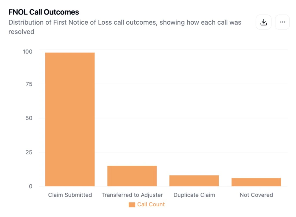
Stacked Bar Chart
Show the composition within each category. Configure an X Axis and add multiple Bars using the “Add Bar” button, each representing a segment of the stack. Try asking AI: “Show daily calls split by connected vs not connected as a stacked bar”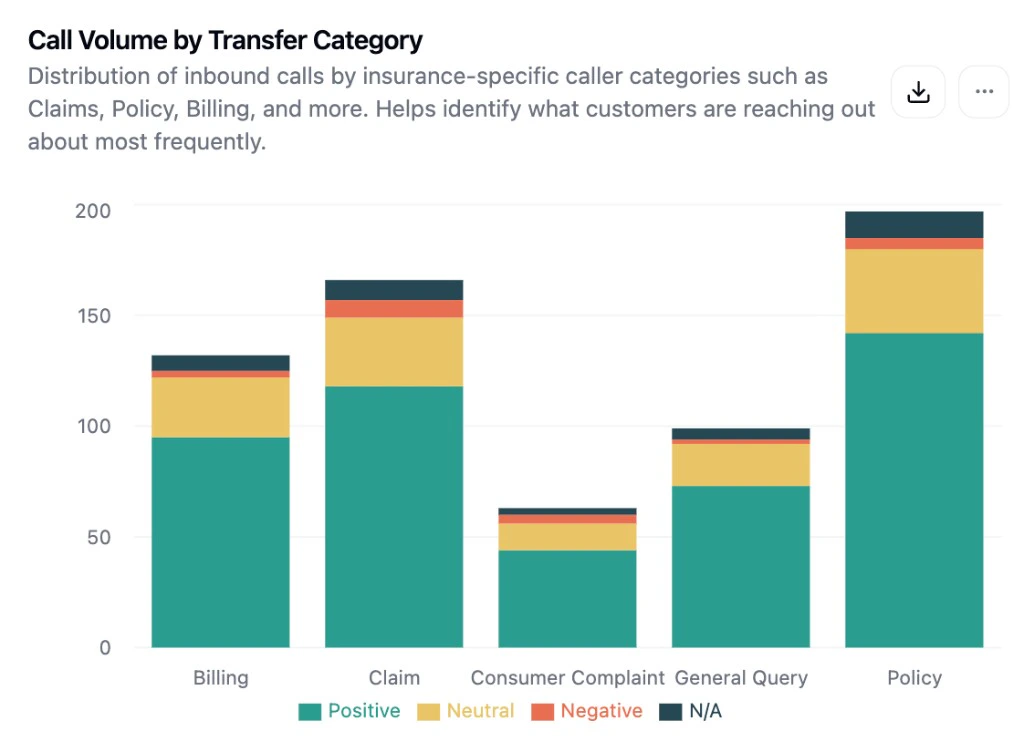
Line Chart
Show trends over time. Configure an X Axis and add one or more Lines. Check “Right Y-axis” on any line to plot it on a secondary axis when metrics have different scales. Try asking AI: “Show my daily connected rate as a line chart over time”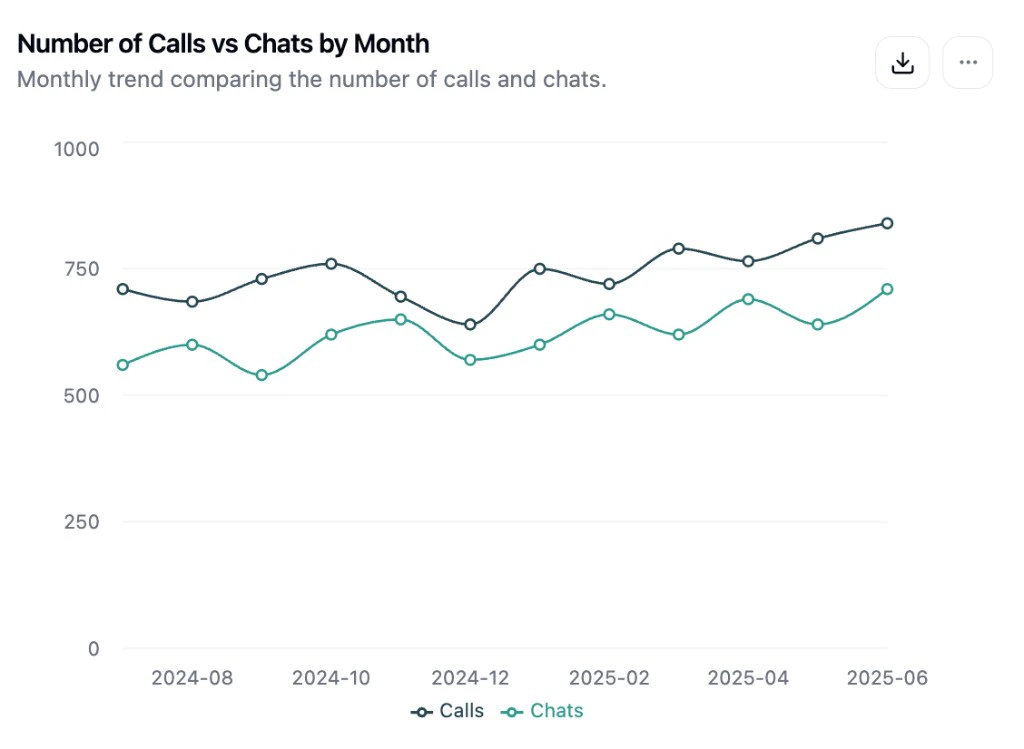
Combo Chart
Overlay bars and lines on the same chart. Perfect for showing a volume metric alongside a rate. Configure an X Axis, add Bars and Lines, and assign each to the left or right Y-axis independently. Try asking AI: “Show call volume as bars and conversion rate as a line on the same chart”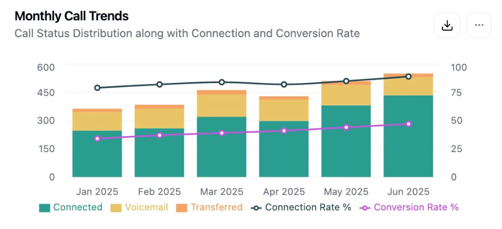
Table
Display your data as rows and columns. Columns are auto-detected from your query. For numeric columns, toggle Mini Bar to show a visual bar representing the relative value. Toggle Exclude to hide a column. Try asking AI: “Create a table of agents with total calls, connected rate, and conversion rate”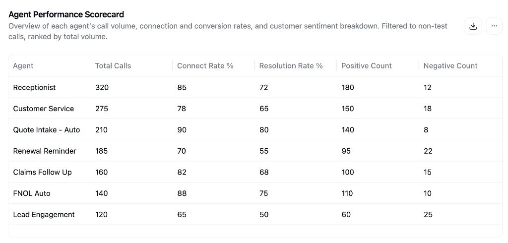
Number (Single Value)
Display a single large metric. Configure a Value Field to select which column to show. Your query should return a single row. Try asking AI: “Show me the total number of calls as a single number”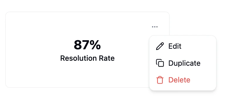
Sankey Diagram
Visualize flows between categories. Configure a Source Field (left side), Target Field (right side), and Value Field (flow width). Adjust node padding and link curvature for styling. Try asking AI: “Show a sankey diagram of how calls flow from status to ended reason”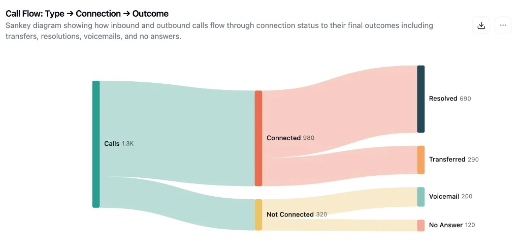
Markdown
Add rich text blocks to your dashboard like section headers, instructions, notes, or documentation. No SQL needed. Click Add Chart > Markdown to open a side-by-side editor with live preview.Using AI Query
The AI Query feature is the fastest way to build and modify charts. Here’s how to get the most out of it.Writing Effective Prompts
Think of it like talking to a coworker. Write your prompt the way you’d ask someone on your team to build you a chart. Be specific about:
- What data you want to see: “calls”, “connected calls”, “conversion rate”, “chat messages”
- How to group it: “by agent”, “by day”, “by campaign”, “by week”
- What chart type: “as a bar chart”, “as a line chart”, “in a table”
- Any filters: “only connected calls”, “exclude test agents”, “from the last 30 days”
- “Show me daily call volume for the last month as a bar chart, broken down by agent”
- “Create a table with each agent’s name, total calls, connected rate, and average duration”
- “What percentage of calls convert, grouped by campaign, as a line chart over time?”
- “Show me data”: too vague, the AI won’t know what metric or chart type you want
- “Calls”: not enough detail about how to visualize or group the data
Opening AI Query
Click the AI Query button in the bottom-right corner of the SQL editor. A chat sidebar opens on the right where you can type your request.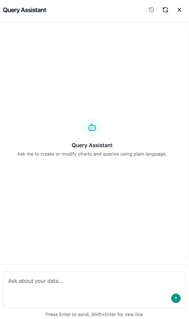
Reviewing Changes
When the AI generates new SQL, it appears as a diff view in the editor showing exactly what changed:- Click Accept to apply the AI’s changes
- Click Reject to revert to your previous query
- Toggle between Unified and Split diff views for easier reading
Iterating on Your Chart
You can have a back-and-forth conversation with the AI to refine your chart. This is one of the most powerful features. You don’t need to get it right in one prompt:- “Change this to a line chart instead”
- “Add a conversion rate line on the right axis”
- “Group by week instead of day”
- “Only include connected calls”
- “The numbers look wrong, can you debug?”