Documentation Index
Fetch the complete documentation index at: https://docs.getstrada.com/llms.txt
Use this file to discover all available pages before exploring further.
Overview
The Analytics page provides powerful insights into your agent’s operations through customizable dashboards and visualizations. Track key performance metrics, analyze trends over time, and create custom charts using SQL queries to extract exactly the data you need. Analytics pulls from all agent data including conversation transcripts, extracted variables, conversation outcomes, agent performance, and custom analysis properties configured in your agent setup.
Agent Selection and Filtering
Agent Dropdown
Select which agent’s data you want to analyze from the dropdown menu at the top of the page. You can view analytics for individual agents or compare performance across multiple agents.Date Range
Choose the time period for your analysis using the date range picker. This filters all metrics and charts on the page to show data only from the selected period.Filter
- Click the Filter button to filter through specific campaigns.
- Click Clear to remove all active filters.
- Use Save Filters to preserve your current filter configuration for future sessions.
Built-In Charts
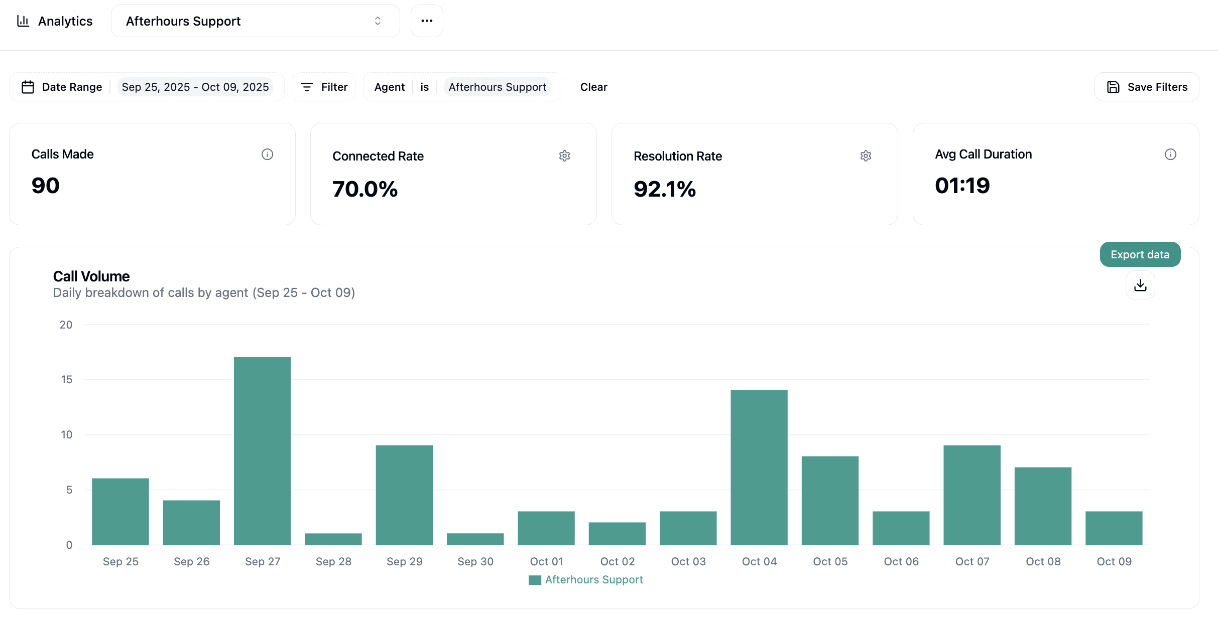
Calls/Chats Made
Total number of calls/chats placed during the selected time period.Connected Rate
Percentage of calls that successfully connected with a person. This metric helps you understand answer rates and optimize calling times.Resolution Rate
Percentage of connected calls/total chats that achieved the desired outcome or resolution. This is your primary measure of campaign effectiveness and agent performance.Avg Call/Chat Duration
Average length of connected calls/chats in MM:SS format. Useful for capacity planning and understanding conversation complexity.Call/Chat Volume Chart
A bar chart showing the daily breakdown of calls/chats by agent over the selected date range. This visualization helps identify:- Peak hours
- Agent activity patterns
- Volume trends over time
Click the download icon (⬇) in the top-right corner of any chart to export the data as CSV.
Custom Charts
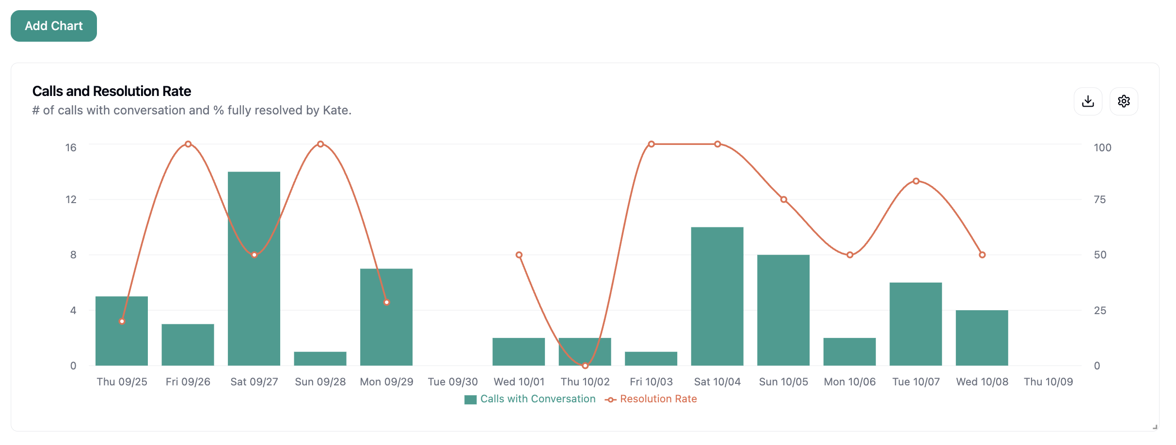
The Analytics page allows you to create custom charts and visualizations based on your own SQL queries. You can build any dashboard you need by writing custom queries that pull data from your call records. This part of the page is customizable down to however you prefer to arrange the blocks of charts, values, and/or tables as per your preference. Some examples of charts you might create include:- Calls and Resolution Rate - Dual-axis chart showing call volume (bars) alongside resolution percentage (line) over time
- Questions by Support Outcome - Table breaking down call outcomes by the type of questions or issues discussed, with resolution rates for each category
- Calls by Resolution Type - Distribution of calls across different resolution categories (deflected, abandoned, resolved, etc.) with visual percentage bars

Creating Custom Charts
Click the Add Chart button to create custom visualizations tailored to your specific needs. When you create or edit a chart, you’ll access a powerful configuration interface:- Left Panel: SQL Query Editor to write custom SQL queries to extract and aggregate data from your call as well as chat database.
- Right Panel: Visualization Settings to define chart types, axes, values to be displayed, etc.
You can also use the AI Query button when creating a chart for AI to build it end-to-end.