> ## Documentation Index
> Fetch the complete documentation index at: https://docs.getstrada.com/llms.txt
> Use this file to discover all available pages before exploring further.
# Chat Widget
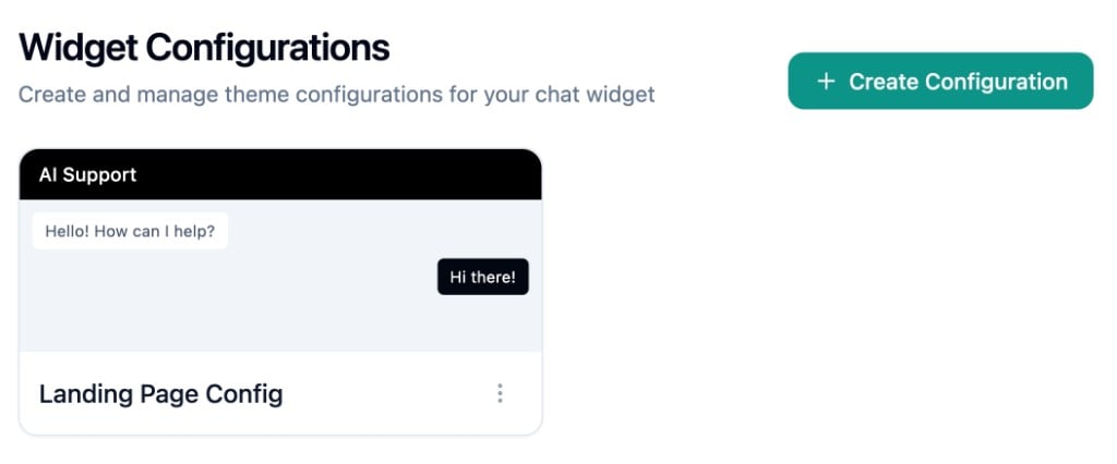
> Create and manage theme configurations for your chat widget
## Overview
The Chat Widget page lets you create and manage visual themes for your chat widget. Each configuration controls the colors, branding, and display options that your end users see when interacting with the widget.
***
## Configurations
The page displays a grid of configuration cards. Each card shows a mini preview of the theme with the header colors, agent message, and user message bubble styled to match. Below the preview is the configuration name and a **Default** badge if applicable.
 ### Creating a Configuration
Click **Create Configuration** to open the form dialog. The dialog is split into two panels: the form on the left and a live preview on the right that updates in real time as you adjust settings.
Toggle between **Light** and **Dark** mode at the top of the preview to edit and preview each theme variant.
### Creating a Configuration
Click **Create Configuration** to open the form dialog. The dialog is split into two panels: the form on the left and a live preview on the right that updates in real time as you adjust settings.
Toggle between **Light** and **Dark** mode at the top of the preview to edit and preview each theme variant.
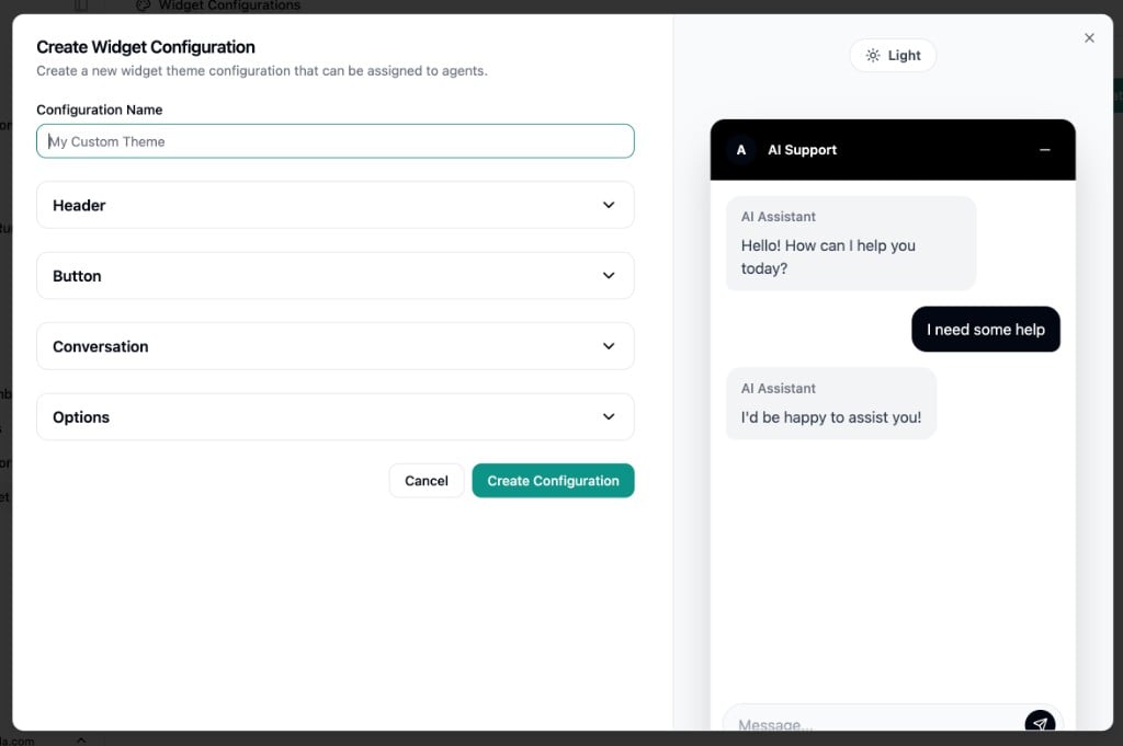 ### Theme Settings
The form is organized into collapsible sections:
**Header**
* **Header Text** - Title displayed at the top of the chat window
* **Header Background Color** - Supports hex colors or CSS gradients
* **Header Text Color** - Hex color for header text
* **Icon URL** - Optional image URL for the header avatar
* **Disclaimer Text** - Rich text shown at the top of the chat window if provided
**Button**
* **Button Text** - Label on the floating launcher button. Leave empty for an icon-only circular button, or add text for a pill-shaped button
* **Button Color** - Supports hex colors or CSS gradients
* **Button Text Color** - Hex color for the button label
**Conversation**
* **Agent Name** - Display name shown on agent message bubbles
* **Message Placeholder** - Placeholder text in the message input field
* **Accent Color** - Applied to user message bubbles and the send button. Supports hex colors or CSS gradients
* **Text Over Accent Color** - Hex color for text on accent-colored elements
**Options**
* **Max Visible Options** - How many quick-reply option buttons are shown before the list scrolls. Set anywhere from 1 to 14
### Dark Mode
Each theme setting has a dark mode counterpart. Toggle the Light/Dark switch in the form to edit the dark mode values. The preview updates accordingly.
### Managing Configurations
Use the menu on each configuration card to:
* **Edit** - Modify the configuration
* **Set as Default** - Make this configuration the organization default. Only one
configuration can be default at a time
* **Delete** - Remove the configuration. You cannot delete a configuration that is set
as default
You can also click a card to open it for editing.
### Theme Settings
The form is organized into collapsible sections:
**Header**
* **Header Text** - Title displayed at the top of the chat window
* **Header Background Color** - Supports hex colors or CSS gradients
* **Header Text Color** - Hex color for header text
* **Icon URL** - Optional image URL for the header avatar
* **Disclaimer Text** - Rich text shown at the top of the chat window if provided
**Button**
* **Button Text** - Label on the floating launcher button. Leave empty for an icon-only circular button, or add text for a pill-shaped button
* **Button Color** - Supports hex colors or CSS gradients
* **Button Text Color** - Hex color for the button label
**Conversation**
* **Agent Name** - Display name shown on agent message bubbles
* **Message Placeholder** - Placeholder text in the message input field
* **Accent Color** - Applied to user message bubbles and the send button. Supports hex colors or CSS gradients
* **Text Over Accent Color** - Hex color for text on accent-colored elements
**Options**
* **Max Visible Options** - How many quick-reply option buttons are shown before the list scrolls. Set anywhere from 1 to 14
### Dark Mode
Each theme setting has a dark mode counterpart. Toggle the Light/Dark switch in the form to edit the dark mode values. The preview updates accordingly.
### Managing Configurations
Use the menu on each configuration card to:
* **Edit** - Modify the configuration
* **Set as Default** - Make this configuration the organization default. Only one
configuration can be default at a time
* **Delete** - Remove the configuration. You cannot delete a configuration that is set
as default
You can also click a card to open it for editing.